B2B brand identity, Webflow website, and three years of ongoing design support for an automation startup in the hospitality industry.
Brand identity
·
Graphic Design
·
Web
·
Webflow
·
Social Media
Intro
RobosizeME helps hospitality businesses automate repetitive operational tasks so teams can focus on higher-value work. As a young startup entering a traditionally low-tech industry, they needed a brand that felt credible and professional while remaining approachable for hotel teams new to automation technology.
I partnered with the founder in 2021 to design the brand identity and build their Webflow website, then continued as their primary design partner for three years, covering every touchpoint the business needed as it grew.
Strategy
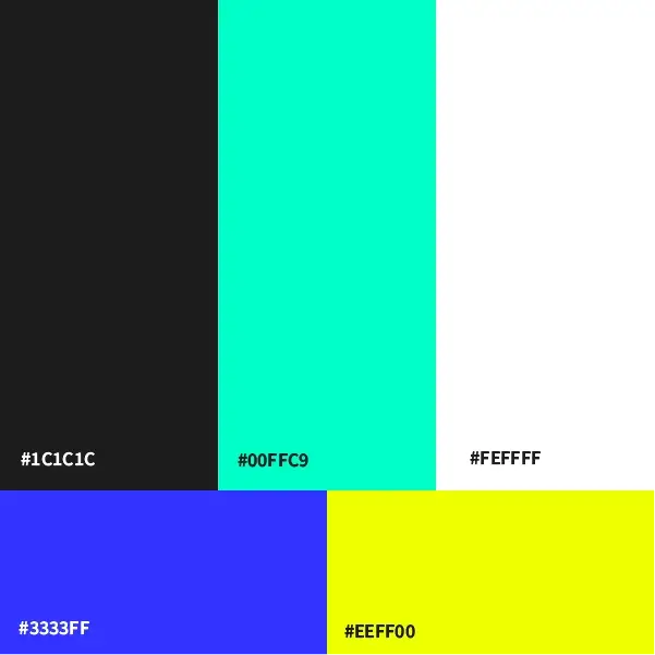
The central tension was technical credibility versus human warmth — a brand that could speak to procurement teams and operations managers without feeling cold or intimidating. The solution was a dark base palette anchored by a vibrant signature green, creating a modern technology aesthetic with enough warmth to feel accessible.
One client constraint shaped the direction significantly: the founders wanted a mascot, a character to personify the service. My recommendation was against it. Since the product is software, not a physical robot, a mascot risked undermining the credibility and also giving the wrong impression about the services on offer. The constraint became a design problem: build a character-led identity that still felt premium and professional.
In-house support
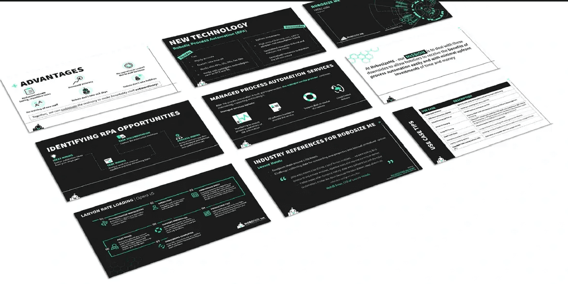
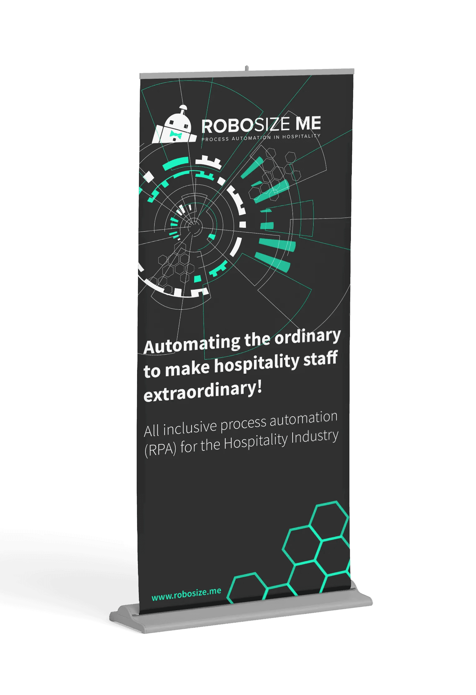
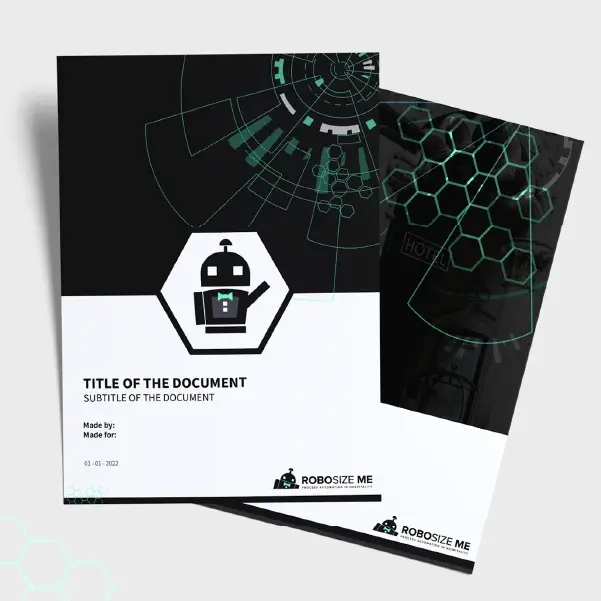
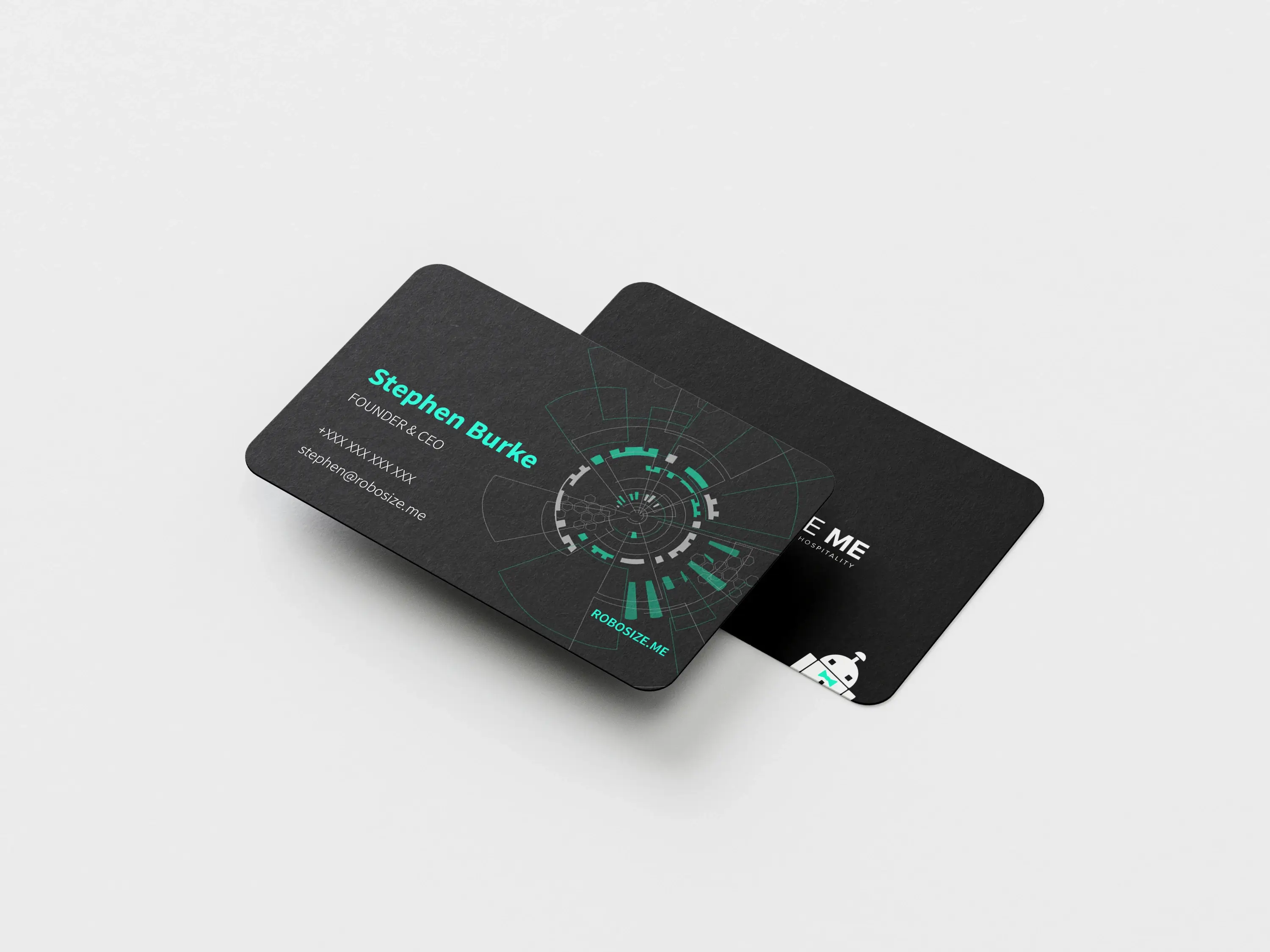
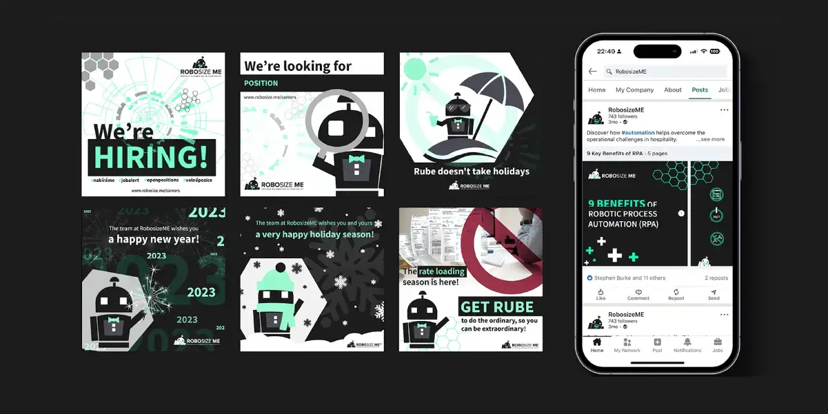
What started as a brand and website project became a long-term design partnership covering all design-related areas of the business. From website maintenance and updates in Webflow through multiple pitches, sales decks, and LinkedIn posts, to email templates, print materials, and merchandise (including business cards, letterheads, t-shirts, rollup banners and conference and trade booth materials). We have also collaborated on motion work (videos and animations).
Every asset was built to work within the original identity system, keeping the brand consistent as the company and team grew.
Visual identity
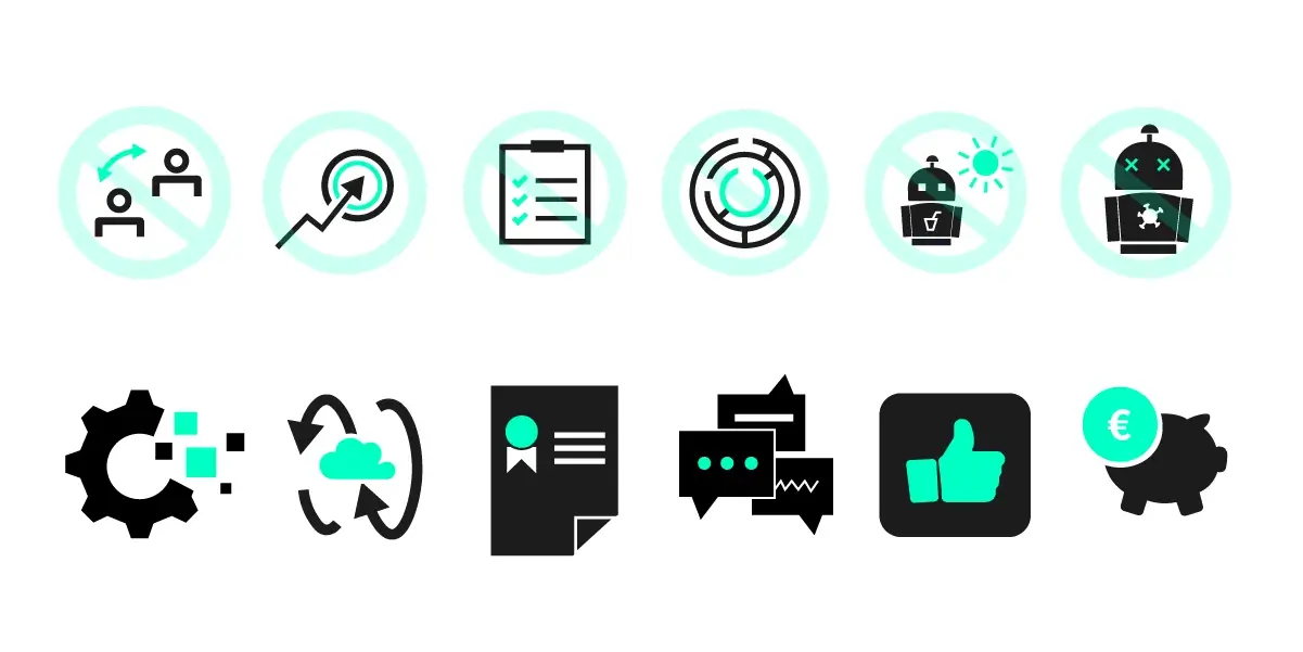
The identity system was built to be disctinct and scalable from day one — logo, animated logo, colour palette, typography, and a custom icon set that could carry the technical subject matter without relying on generic tech imagery. A full brand book documented every element for consistent application across the team.


Sandra is a very reliable and structured collaborator. She consistently delivers on time, communicates clearly, and sticks to what is agreed. Strong in web administration and execution, she brings a calm, professional, and efficient working style that makes collaboration easy.
Zuzana Jakesova
Marketing Specialist | RoboszieME
Looking back
This project taught me more about navigating real commercial constraints than almost anything since. The strategy workshop I pushed for at the start was declined — too time-consuming, the founders said. In hindsight that single decision shaped every subsequent constraint. Starting from a clearer positioning foundation would have produced a stronger system and made the mascot conversation easier to resolve earlier. It's the project that made strategy non-negotiable for me in every engagement that followed.
The company has since rebranded independently. The work shown here reflects the original brand identity and visual system created during our collaboration.
Working on something at this stage?
Check out the full services page to see how I can help.