Picasso
Zero-waste brand strategy and circular identity design — from blank page to investor-ready in three weeks.
Brand identity
·
Messaging
·
Web
·
Pitch deck
·
In-store
·
Packaging
Intro
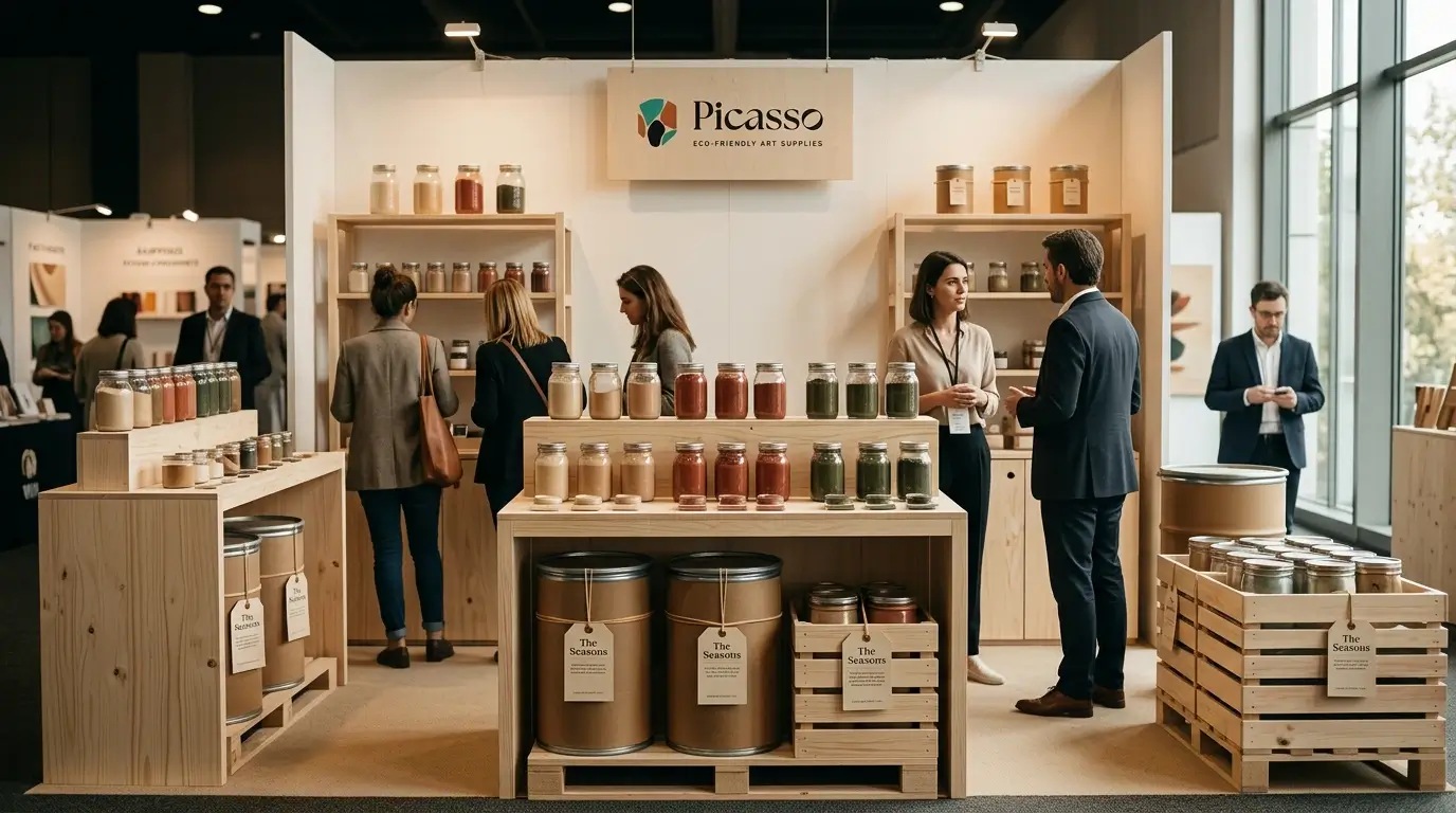
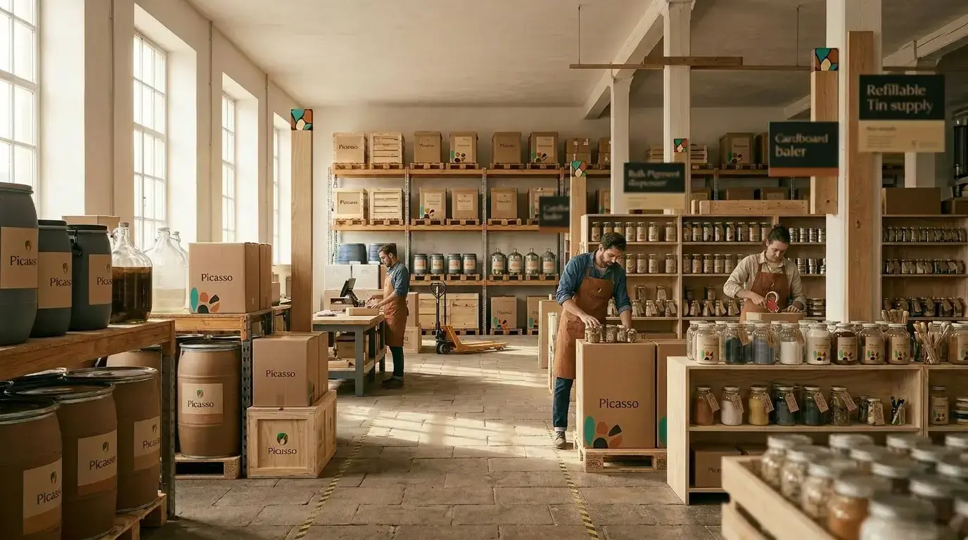
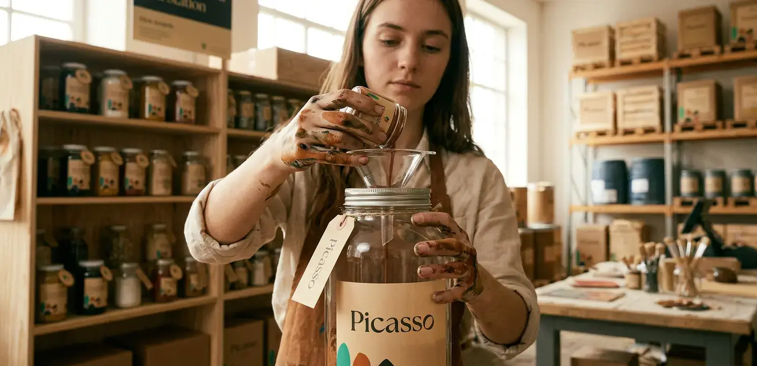
Picasso is a B2B/B2C art supply brand built around a closed-loop model — reclaimed containers, recyclable packaging, and a return program for empties. A concept store brings the zero-waste mission to makers and conscious shoppers.
What didn't exist was any way to present this to the outside world. The brief: "I need something to show investors, partners, and potential stockists." One requirement beyond the commercial — the identity should be rooted in nature.
Strategy
The opportunity wasn't to make a slightly better art supply. It was to build the first premium circular brand in the category — one where the business model is the sustainability story.
Two audiences needed different things from the same brand. B2B buyers need commercial confidence and proof the return loop works. B2C customers — artists, makers, conscious shoppers — need desire. A brand they'd choose even if a cheaper option was right next to it.
The positioning deliberately avoids sustainability clichés. No muted tones, no apologetic messaging. Instead: a premium retail aesthetic and a material story grounded in how the product actually moves through the world.
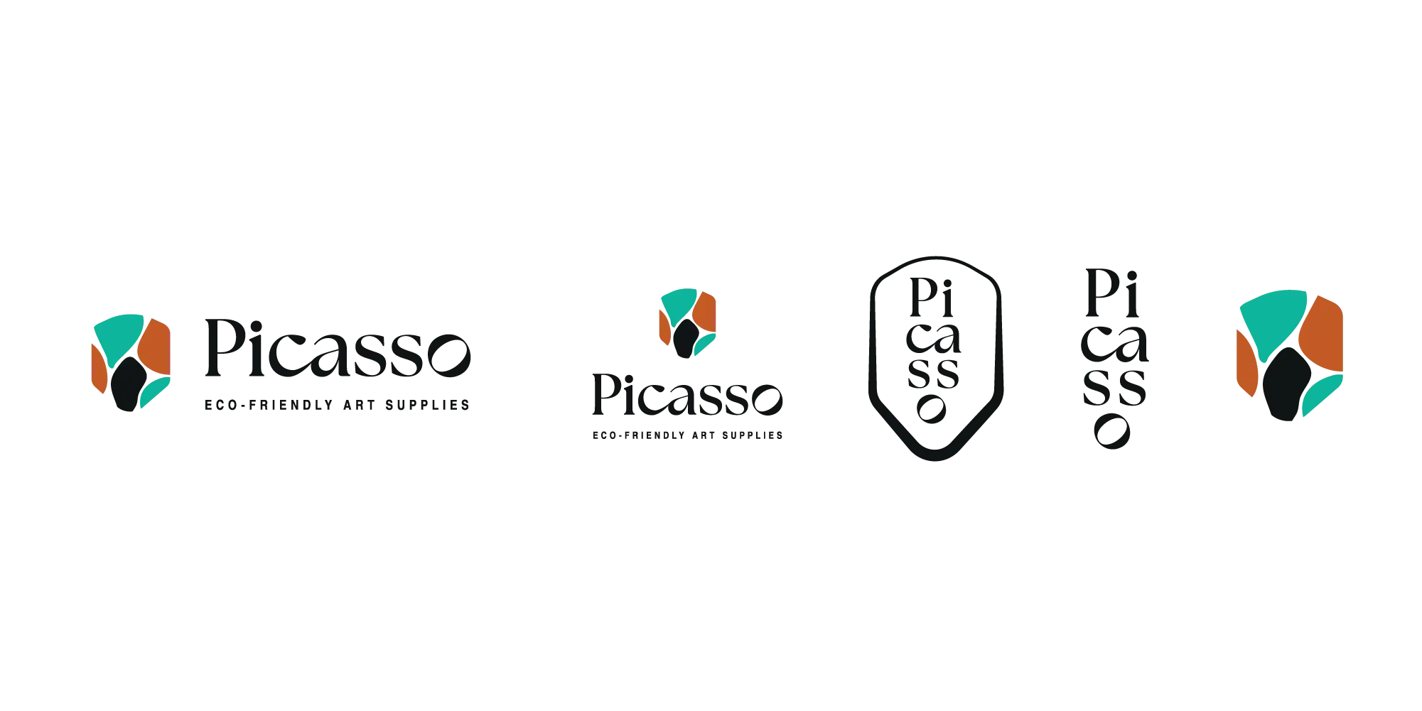
The name came from nature. Sphaerocoris annulus (also known as the Picasso bug) is a sub-Saharan insect whose vivid ring-shaped markings aren't decorative, they're a defence mechanism. The bug is striking because it has to be. That became the visual and strategic brief in one sentence, shaping the name, the brand graphics, and the overall design direction.

Verbal identity
Confident without being loud. The language treats circularity as a serious commitment and earns trust by explaining how rather than just claiming what — speaking to a procurement buyer and a maker in a concept store without changing register entirely.
Art supplies that stay in the loop. Premium art supplies built to move through the world without leaving it worse.
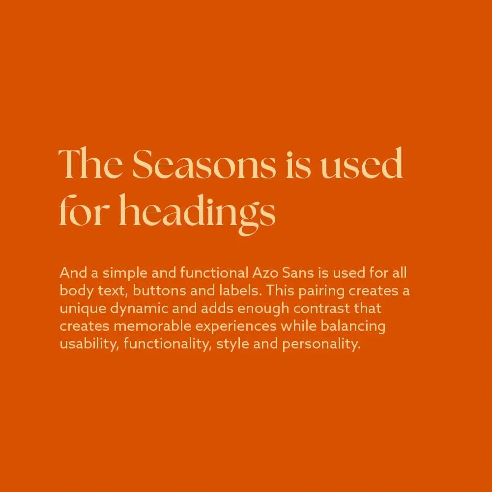
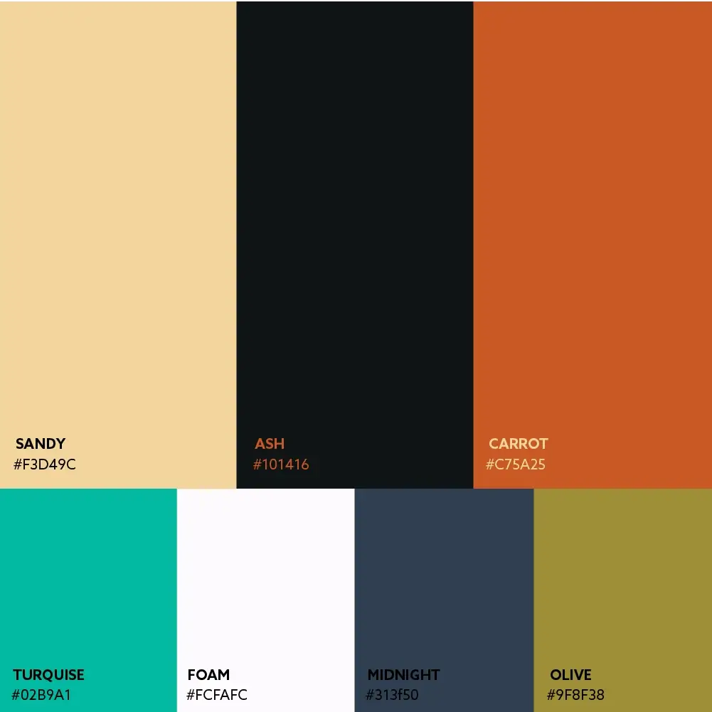
Visual identity
Sustainability
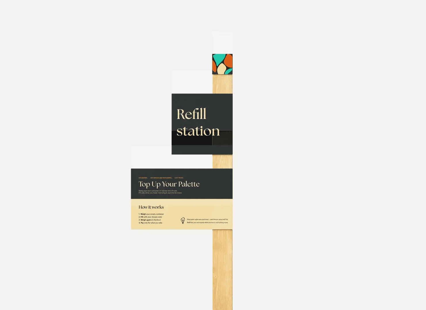
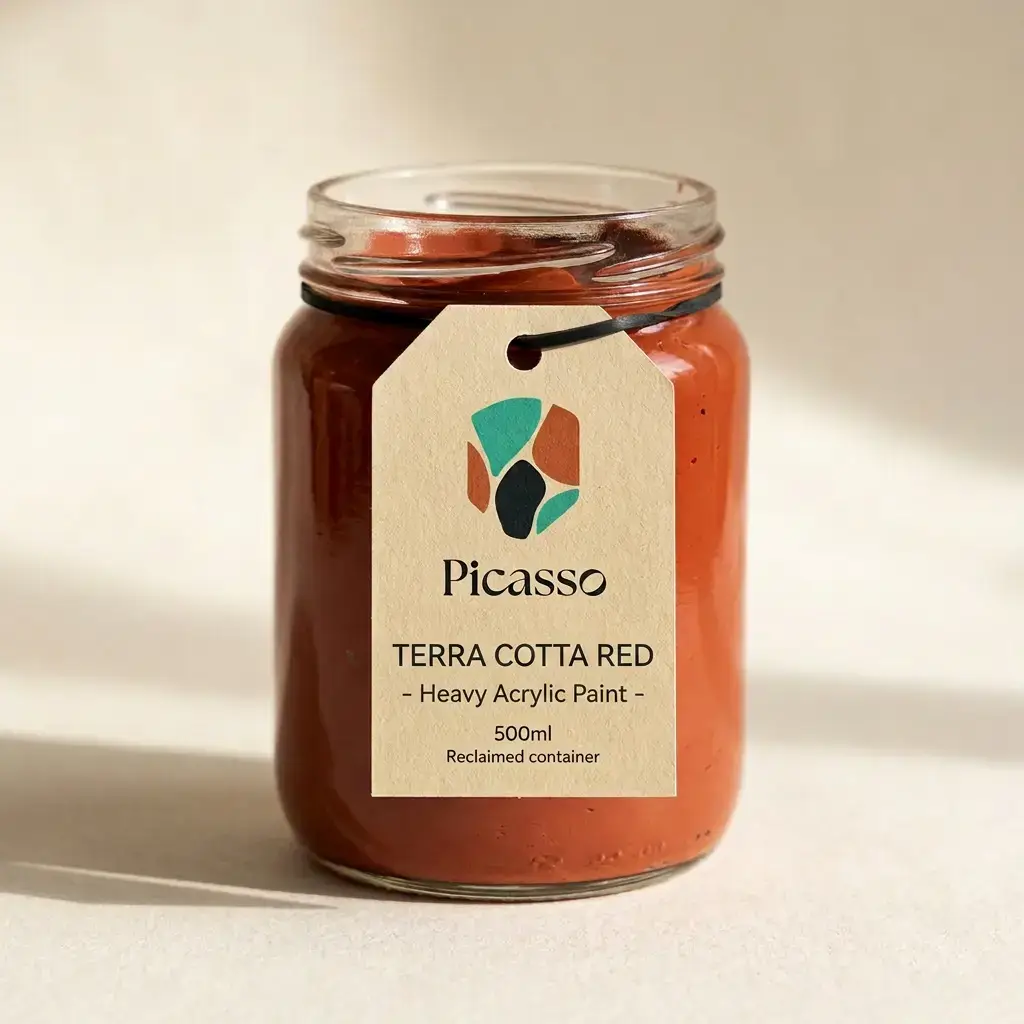
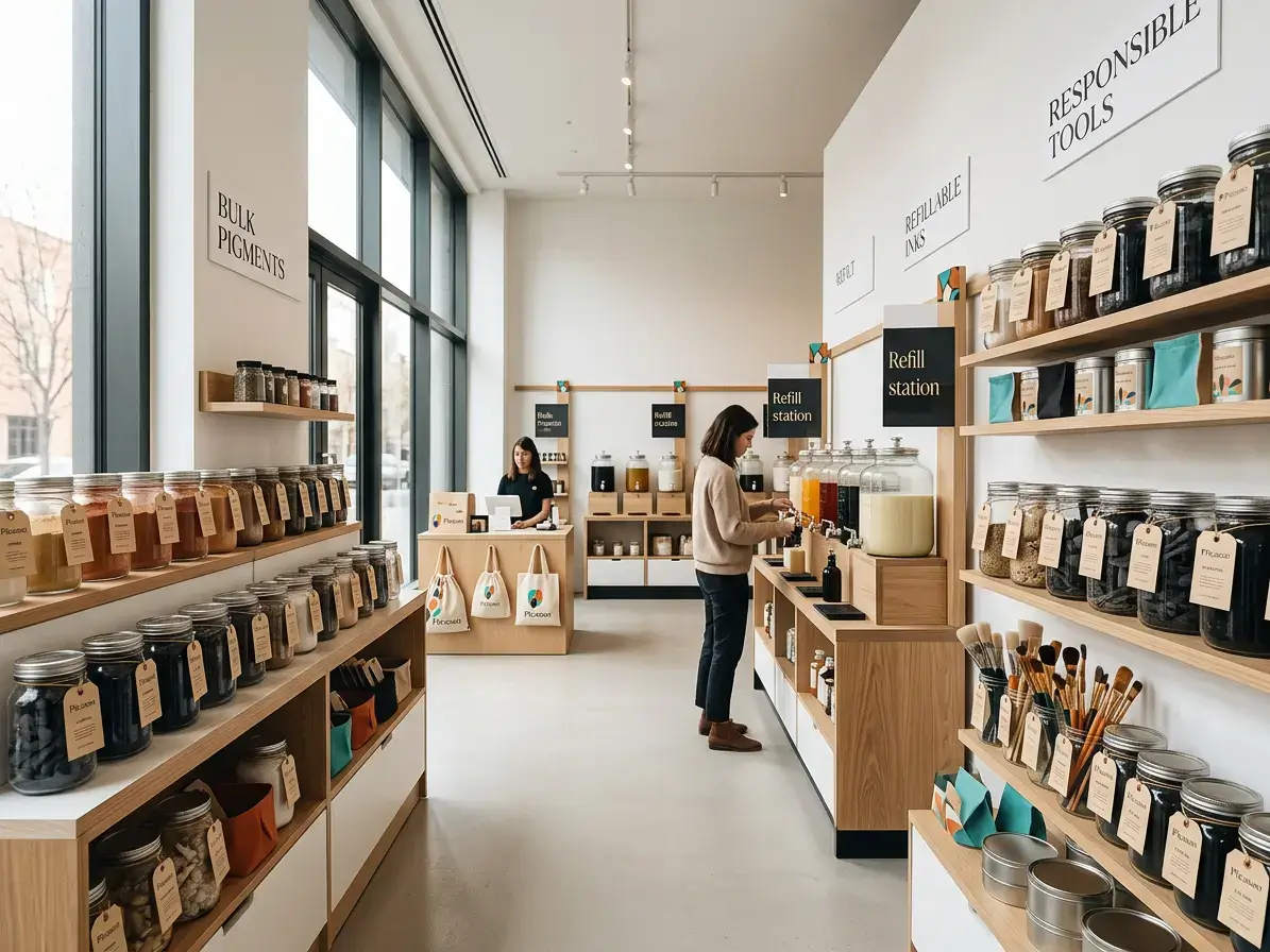
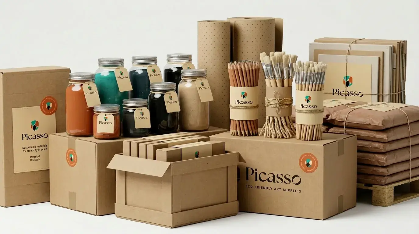
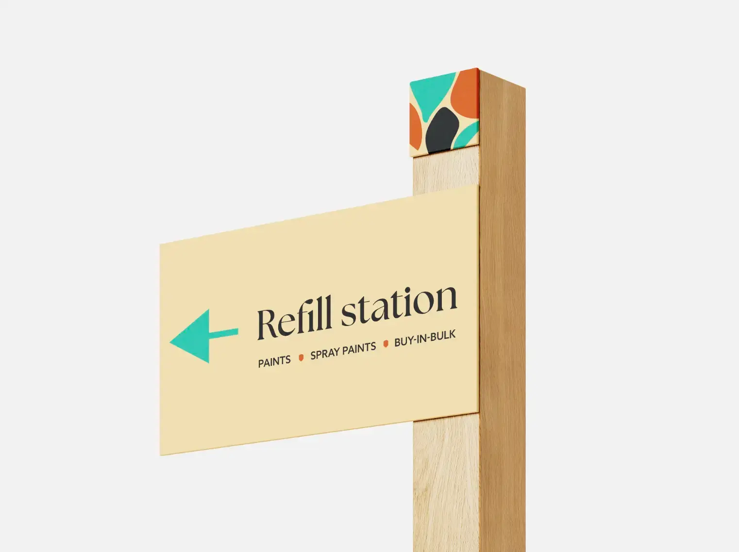
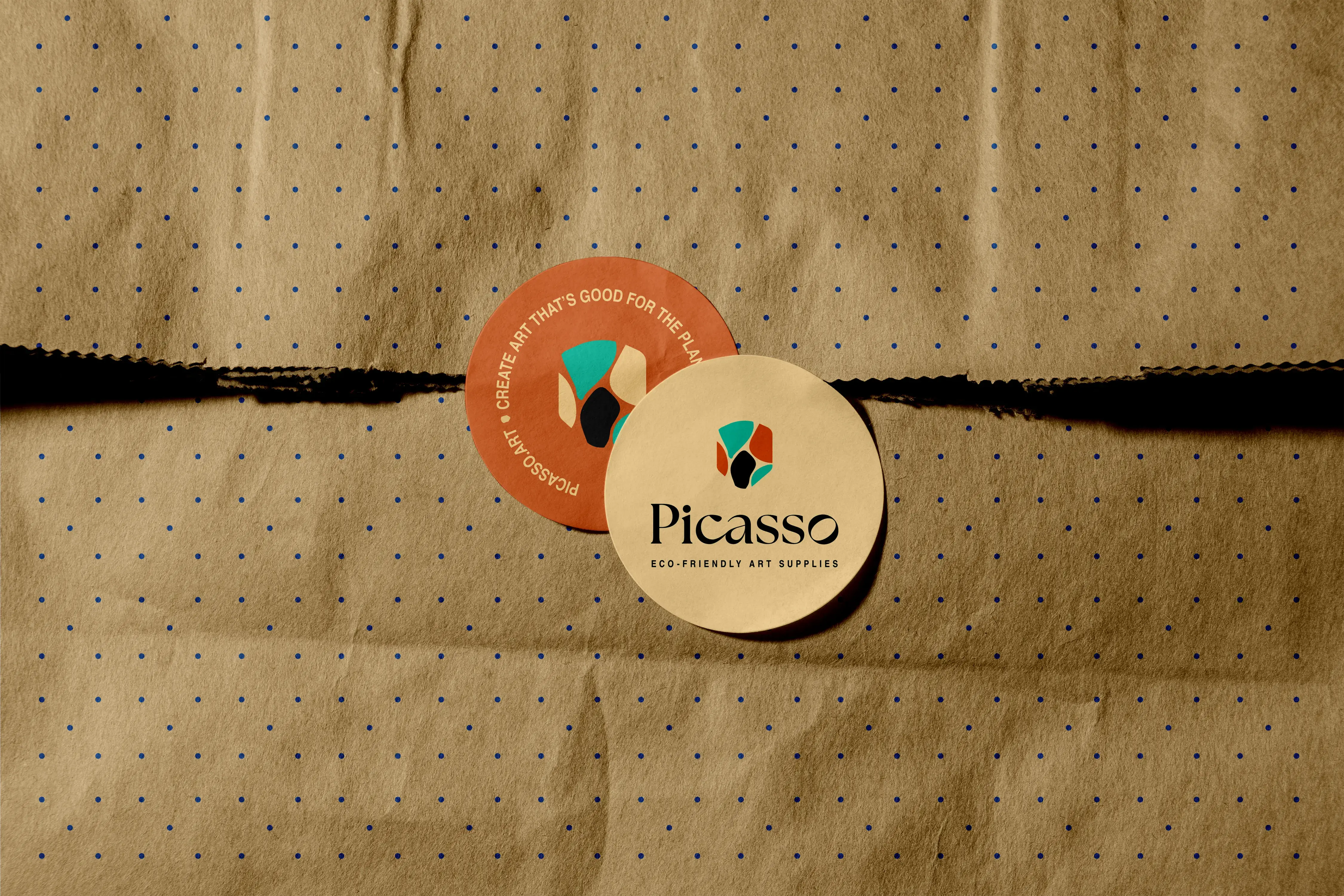
A few decisions worth naming. The return system is built into the commercial relationship — B2B partners return empties with their next order, no separate process. Containers use a paper tag on a rubber tie instead of adhesive labels, which make most packaging non-recyclable. Sourcing prioritises reclaimed containers; new stock only fills the gap. No laminate or foil on any printed material. The in-store signage system is modular — nothing gets reprinted when ranges change.
Outcome
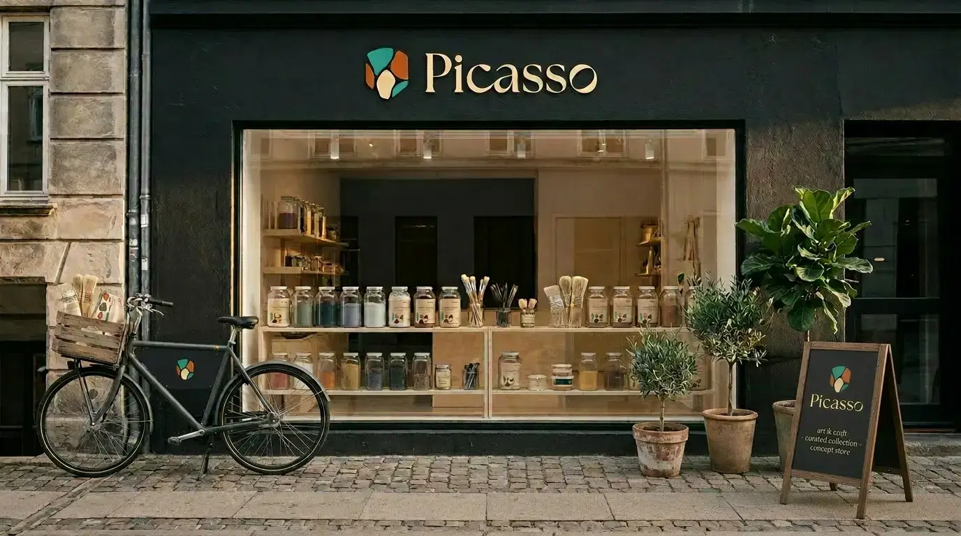
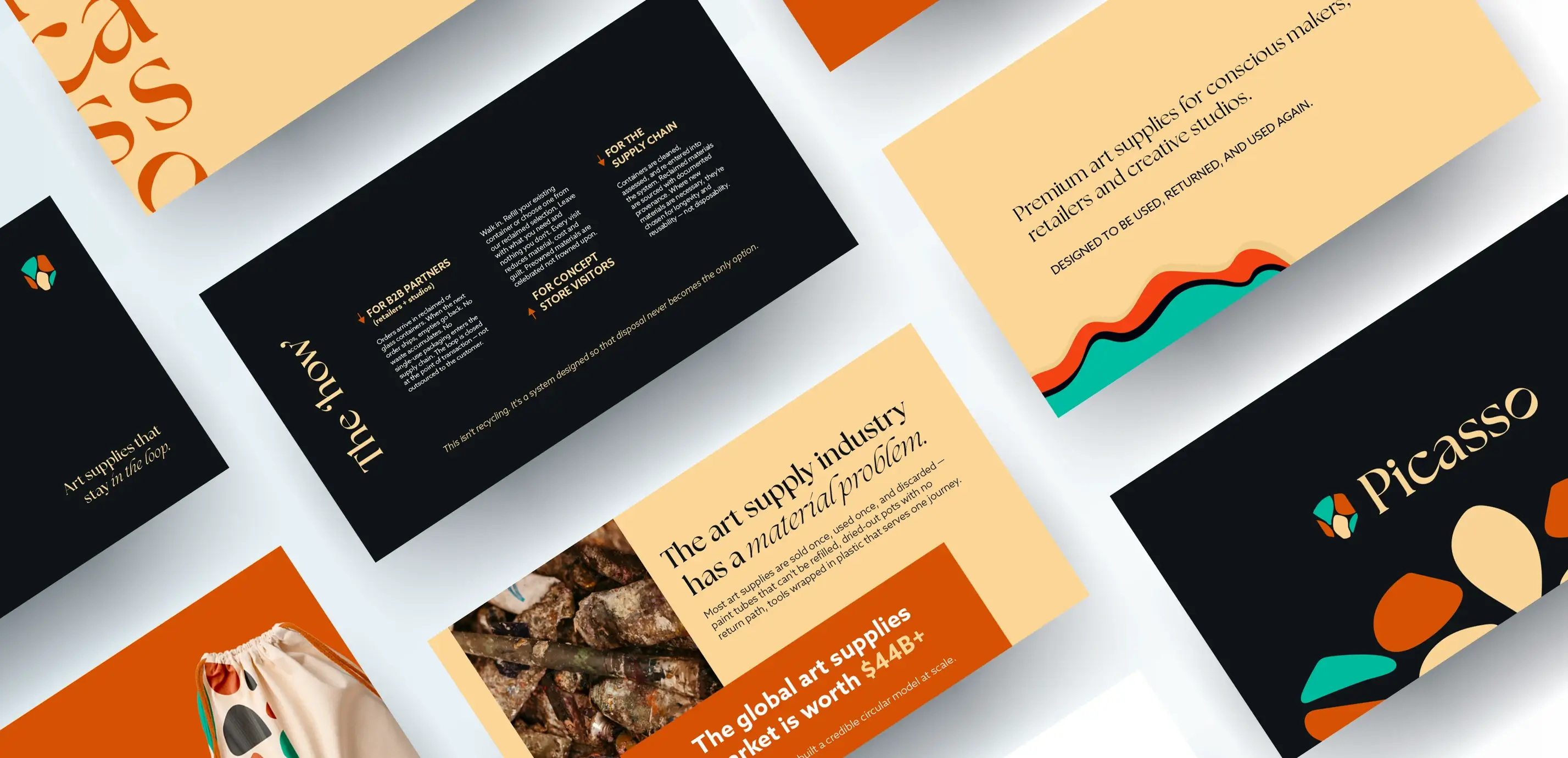
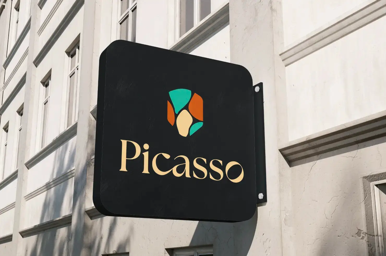
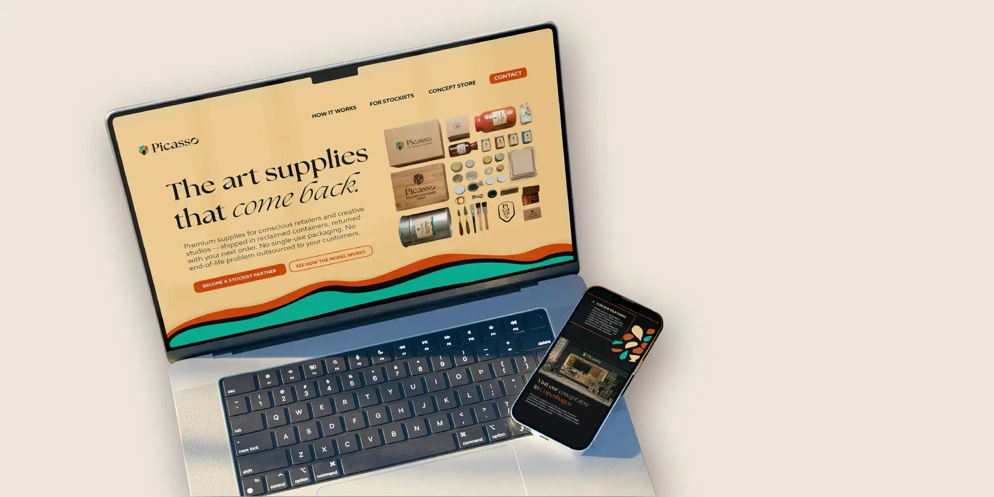
Picasso launched as a complete brand — from positioning to pitch deck to concept store — built to operate across three very different rooms: a funding meeting, a retailer conversation, and a consumer-facing store. The identity system works across reclaimed containers of any shape or size, the pitch deck tells the investment story in ten slides, and the in-store environment makes the circular model tangible rather than theoretical. A concept brand that doesn't need to explain itself before it starts selling.
Working on something at this stage?
The Launch Kit is built for exactly this — three weeks, flat fee, full brand foundation.