Inagio
Full brand strategy process — workshop, visual identity, packaging, and web design for a jewelry startup entering the Czech market.
Brand Strategy
·
Visual Identity
·
Web Design
·
Packaging
Intro
INAGIO came with a business idea, decades of family expertise in gold, and no brand. No visual direction, no positioning, no clear sense of who they were speaking to or how. The brief was to build everything from scratch — starting with understanding what the brand actually needed to be before anything was designed.
Strategy
We started with an in-person brand strategy workshop led by me with all the key stakeholders present. Throughout the workshop, we defined the core challenge: positioning. INAGIO needed to feel premium enough to justify the quality, accessible enough to compete on price, and fresh enough to attract a younger, very style-conscious audience that existing jewelry brands on the Czech market were largely ignoring.
The positioning landed on everyday luxury. High-quality Italian-crafted gold jewelry at an accessible price point, targeting urban professionals aged 25–40 who see jewelry as both self-expression and an investment. A deliberate emphasis on inclusivity across gender identities opened the brand to an underserved audience that no direct competitor was speaking to.
The brand personality was mapped across archetypes — primarily Lover, with a Creator thread — resulting in a warm, confident, and slightly unconventional identity that avoided both the stiffness of heritage jewelers and the cheapness of budget competitors.
Verbal identity
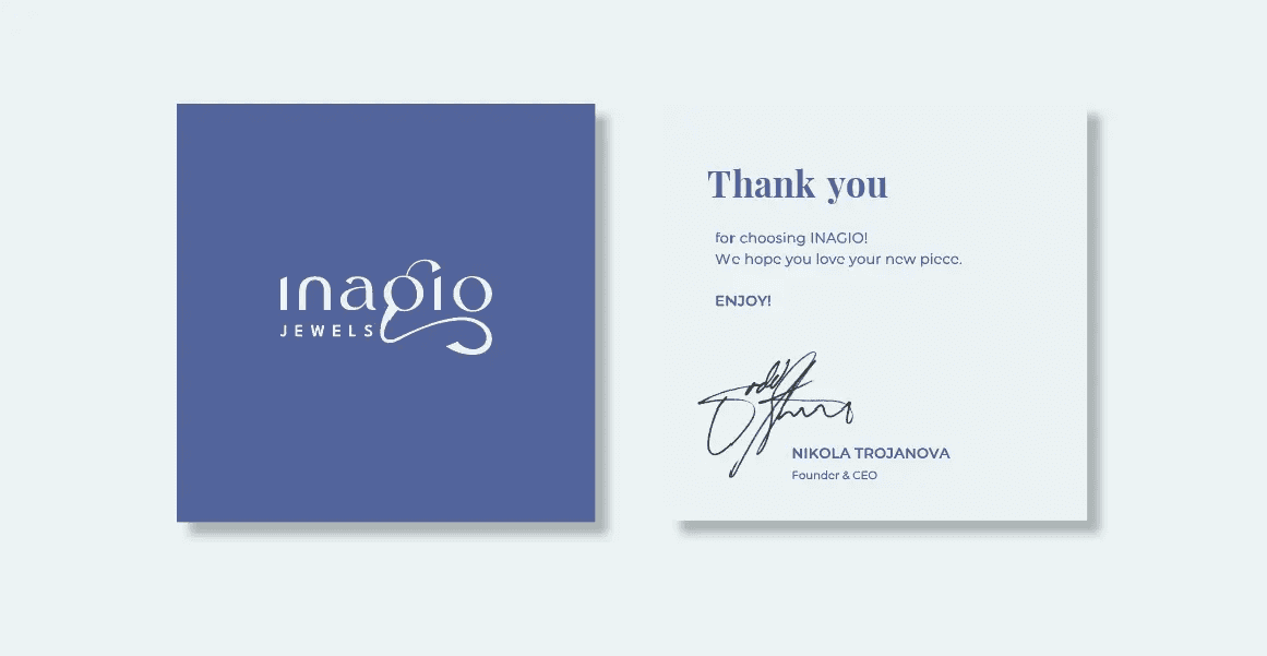
Tone of voice principles were established to guide all communications: friendly and approachable, authentic rather than polished, with a streetwise edge that would resonate with the target audience without alienating older buyers. Given the Czech-speaking audience, foundations were set rather than fully developed — a deliberate scope decision on my part.
High-quality jewelry shouldn't break the bank. Invest in yourself.
Visual Identity
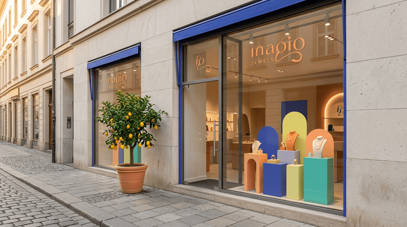
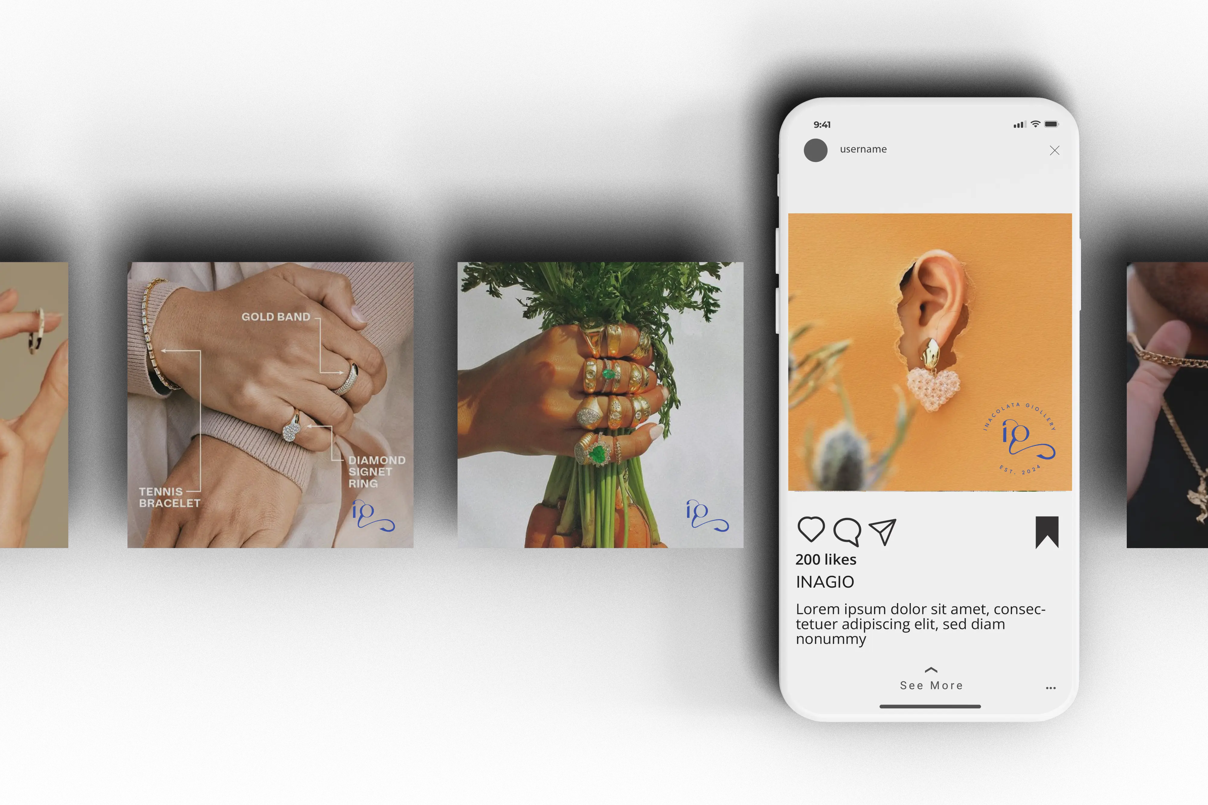
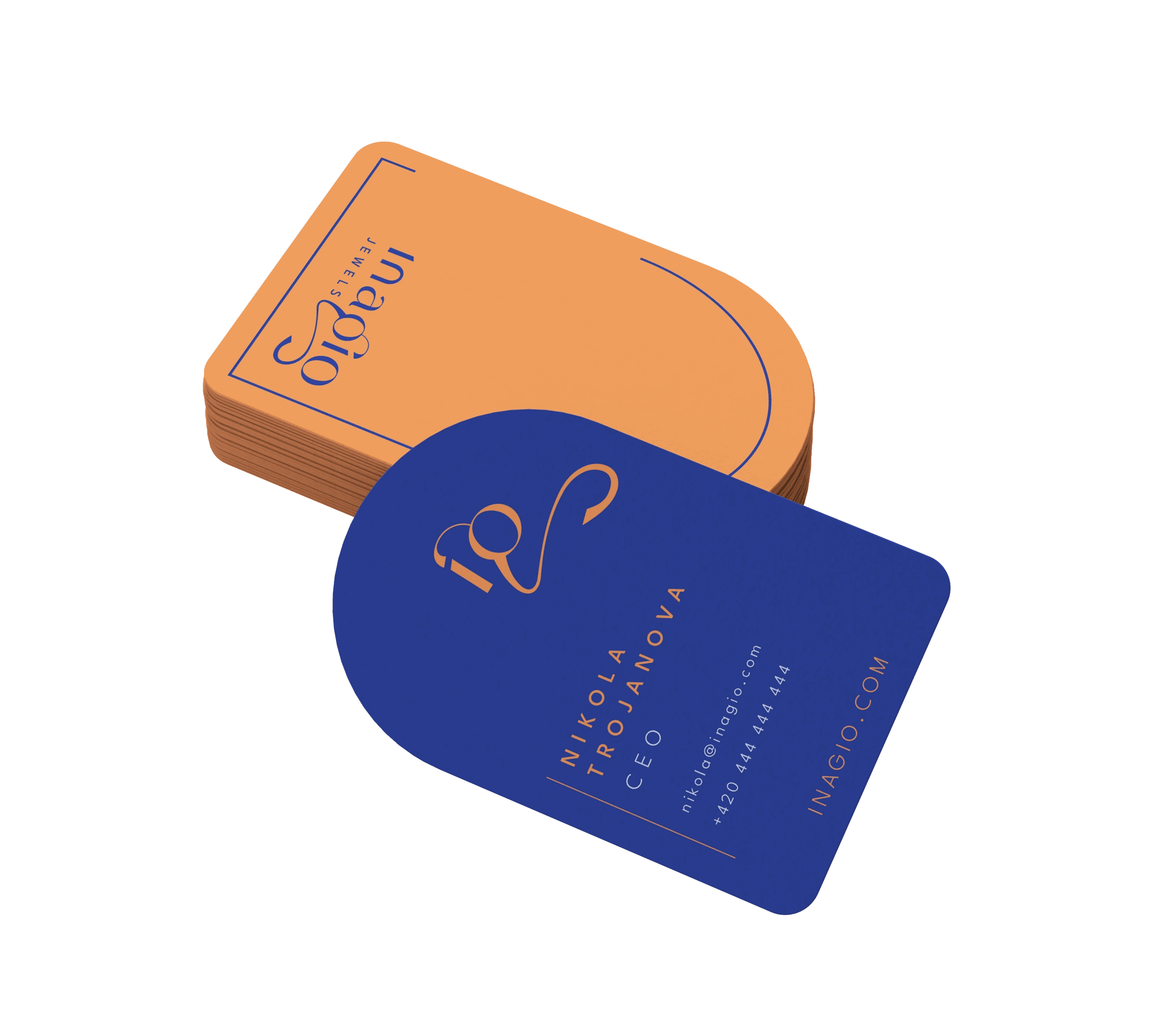
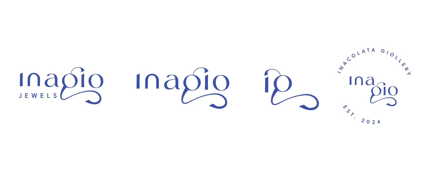
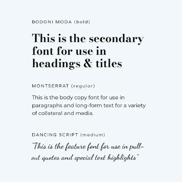
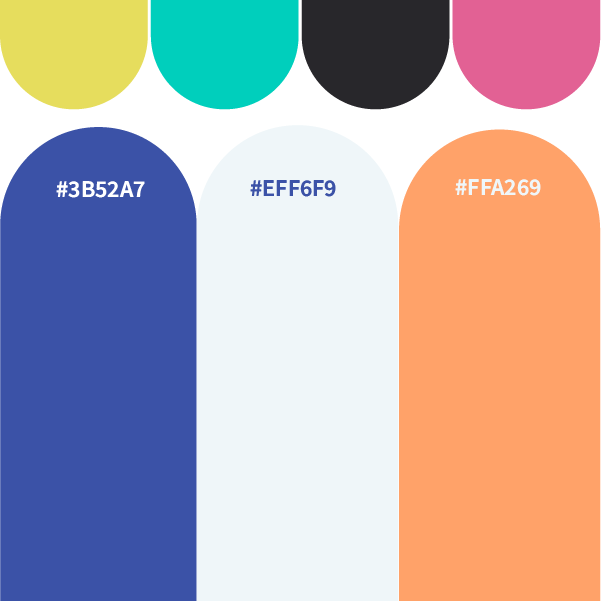
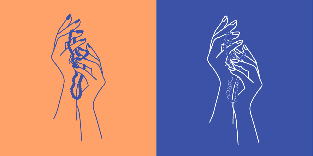
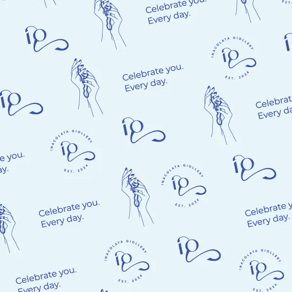
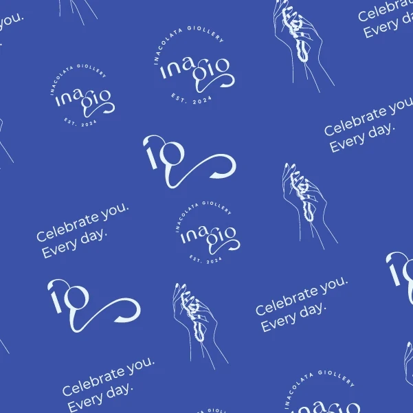
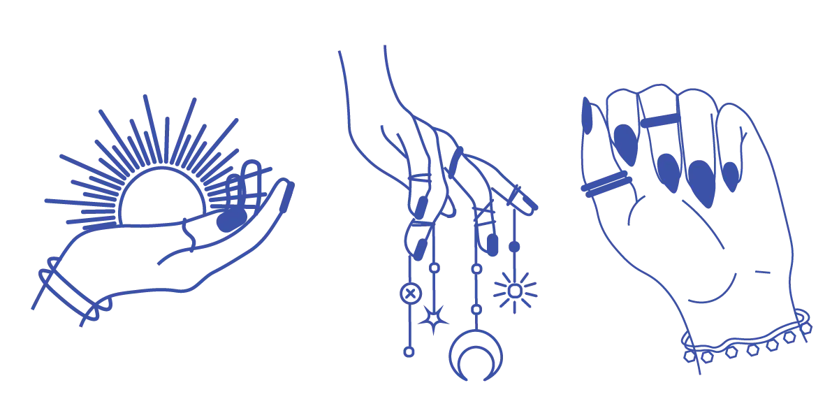
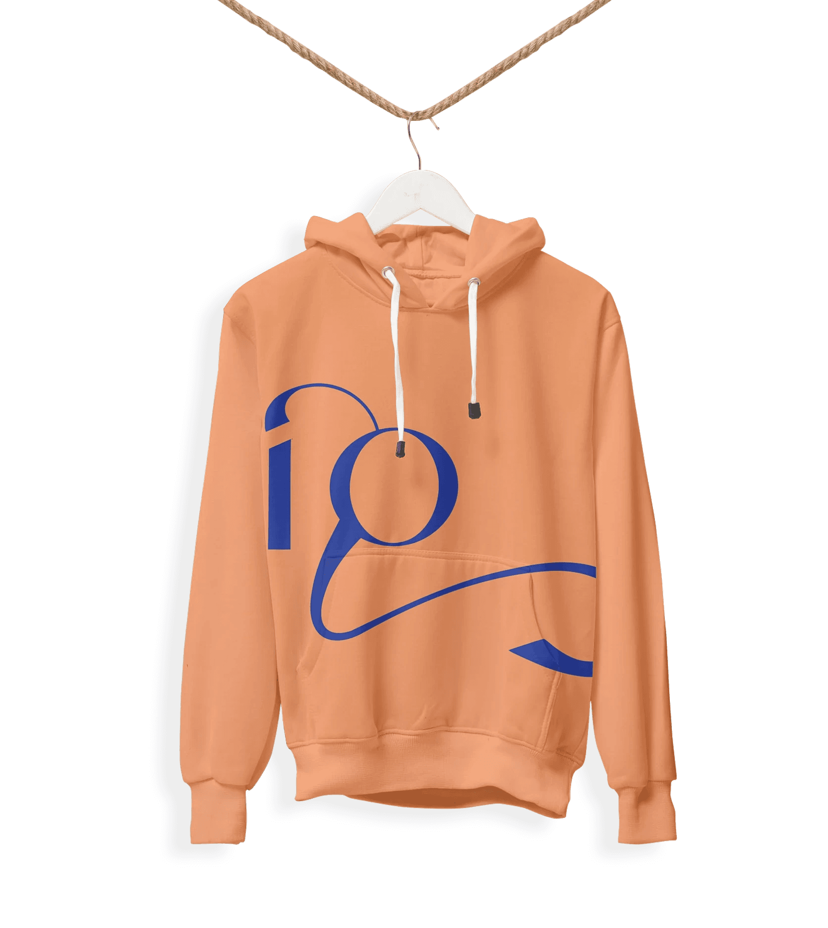
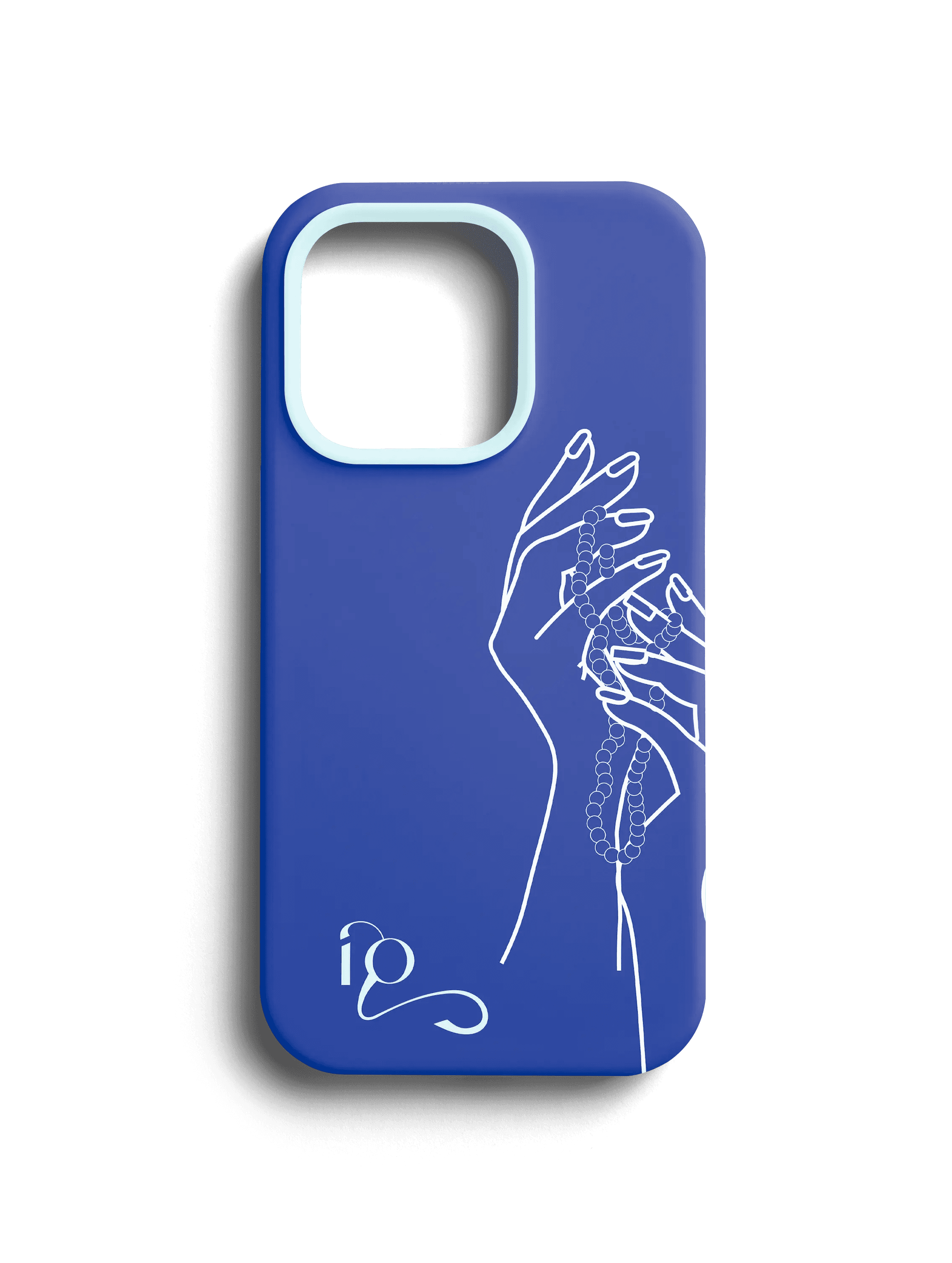
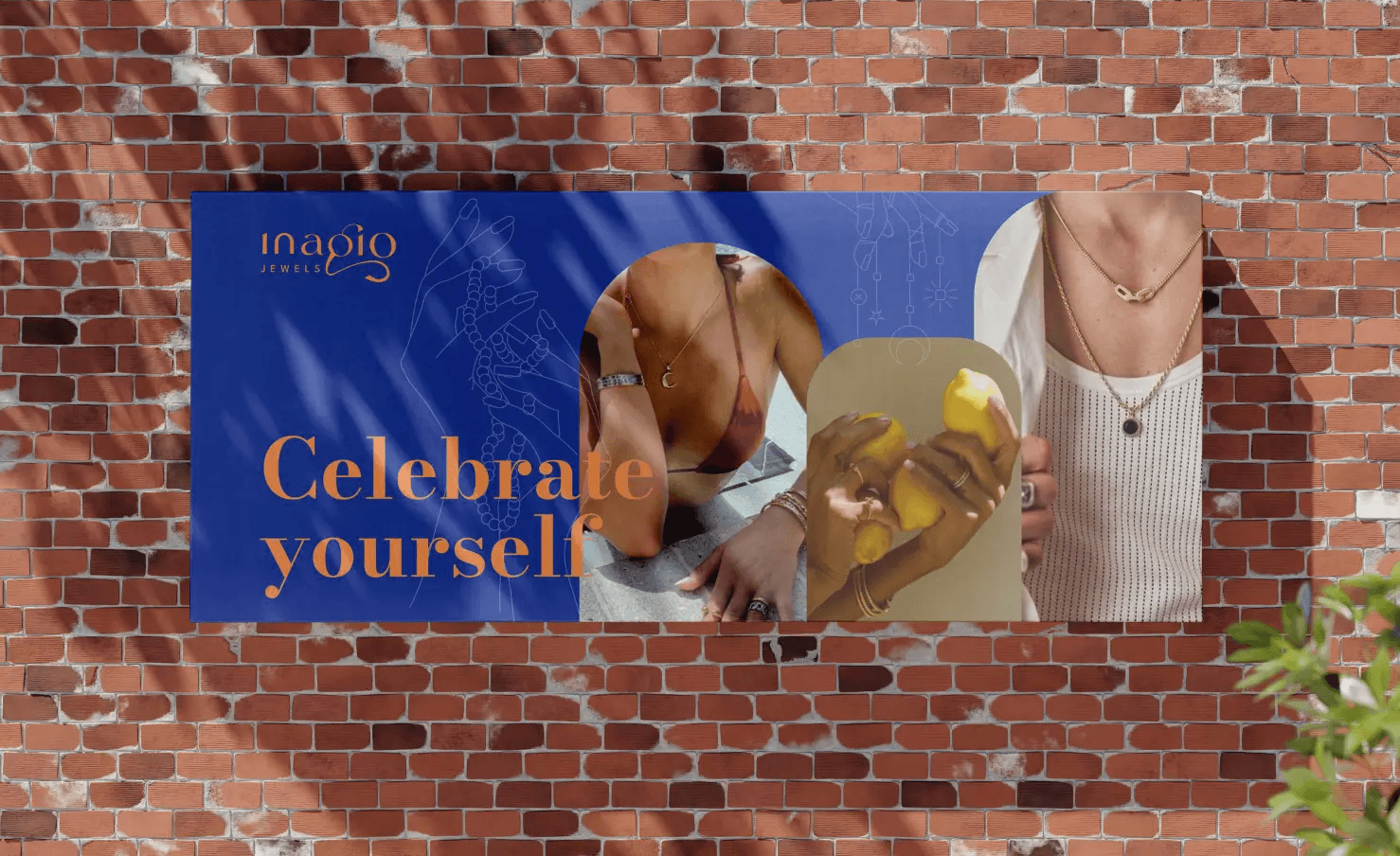
The visual direction grew from the fresh, vibrant brief — a colour palette that stood out against the white-and-gold monotony across every competitor's e-shop. A custom illustration system featuring hands wearing jewelry added warmth and humanity, and a decorative pattern gave the brand a distinctive surface language that worked across both digital and physical touchpoints.
Logo, typography, colour system, illustration style, and brand pattern — all approved without revision.
Packaging & web
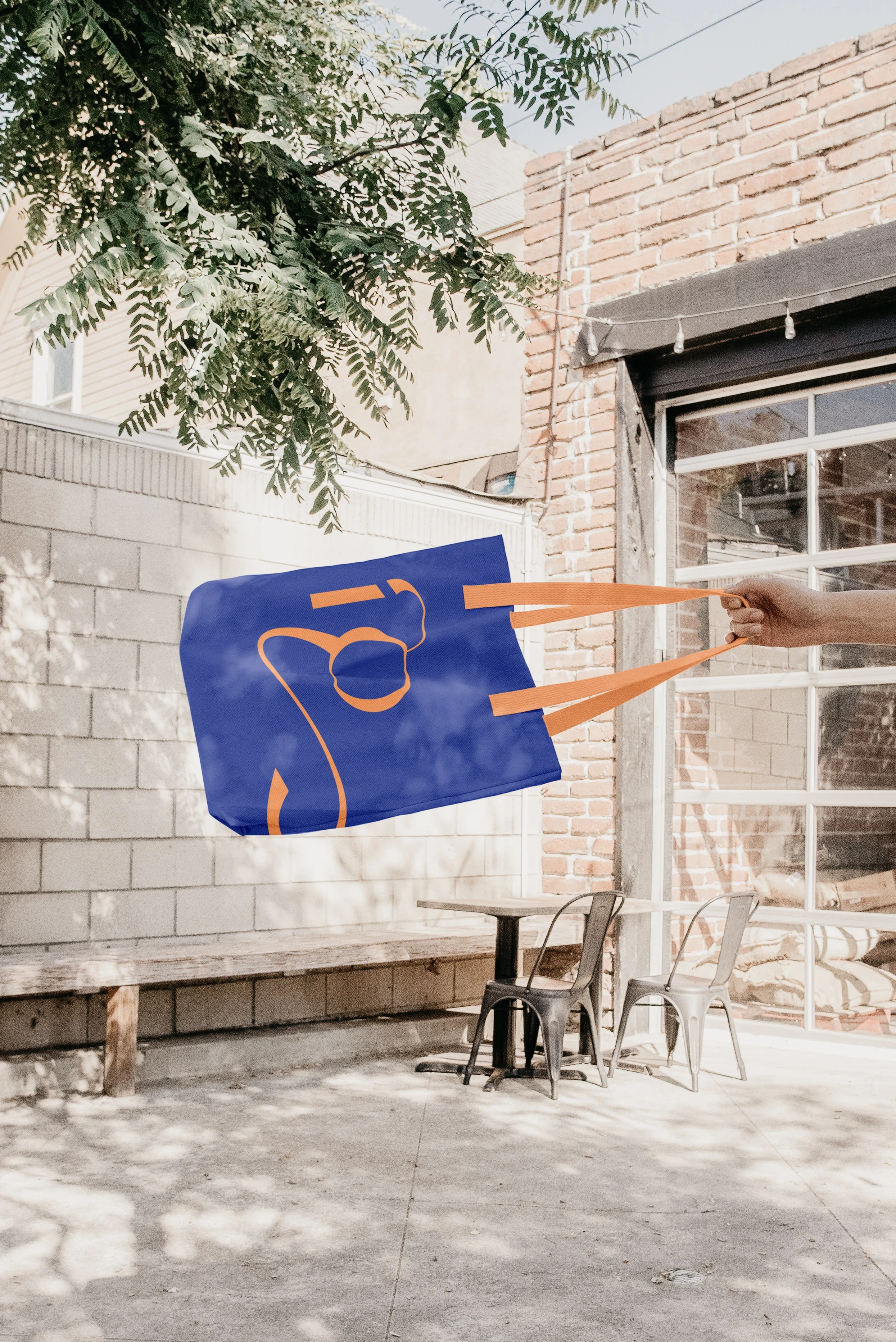
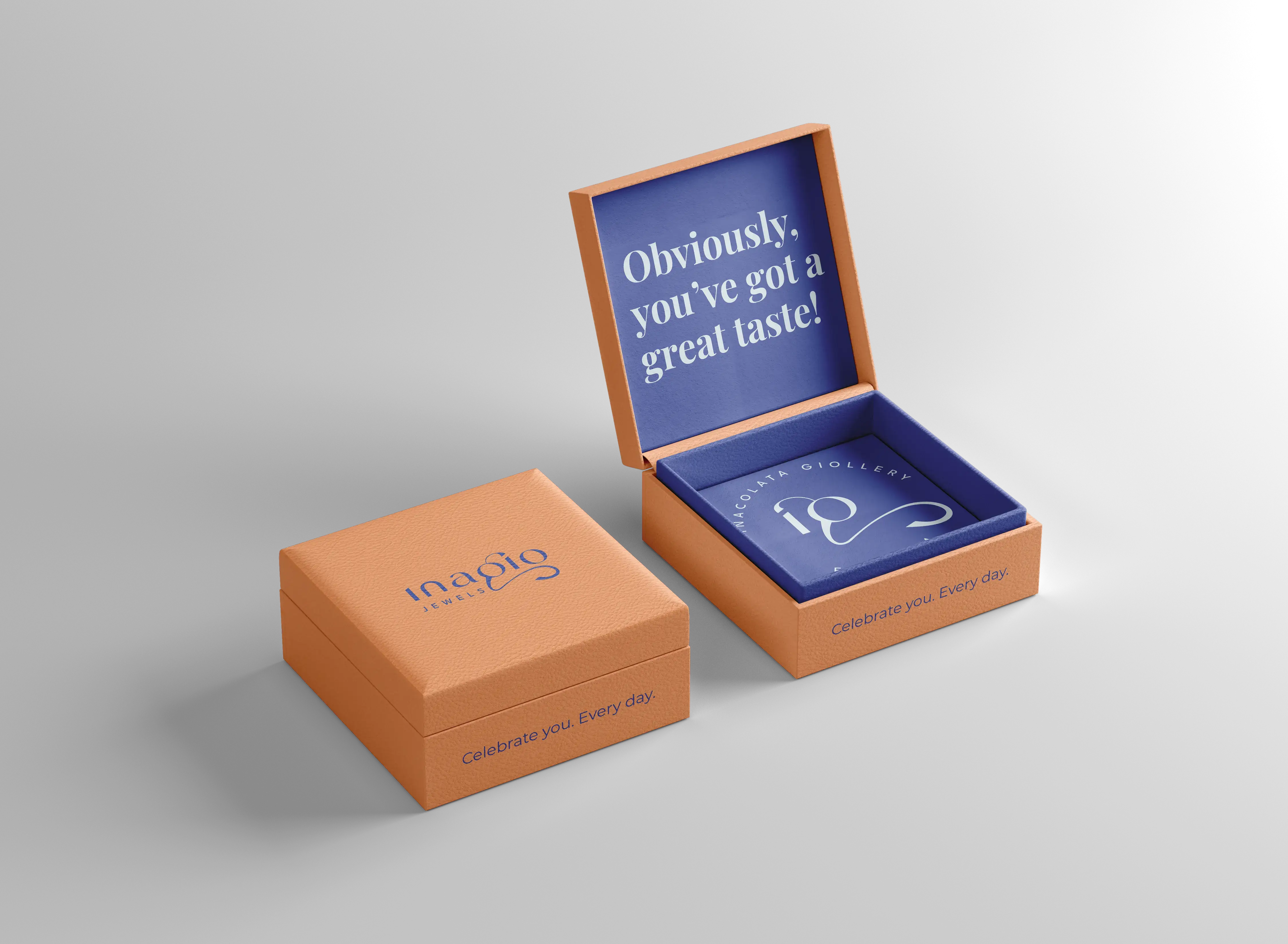
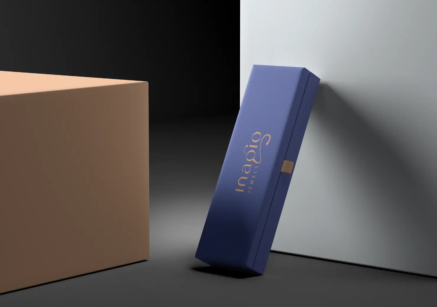
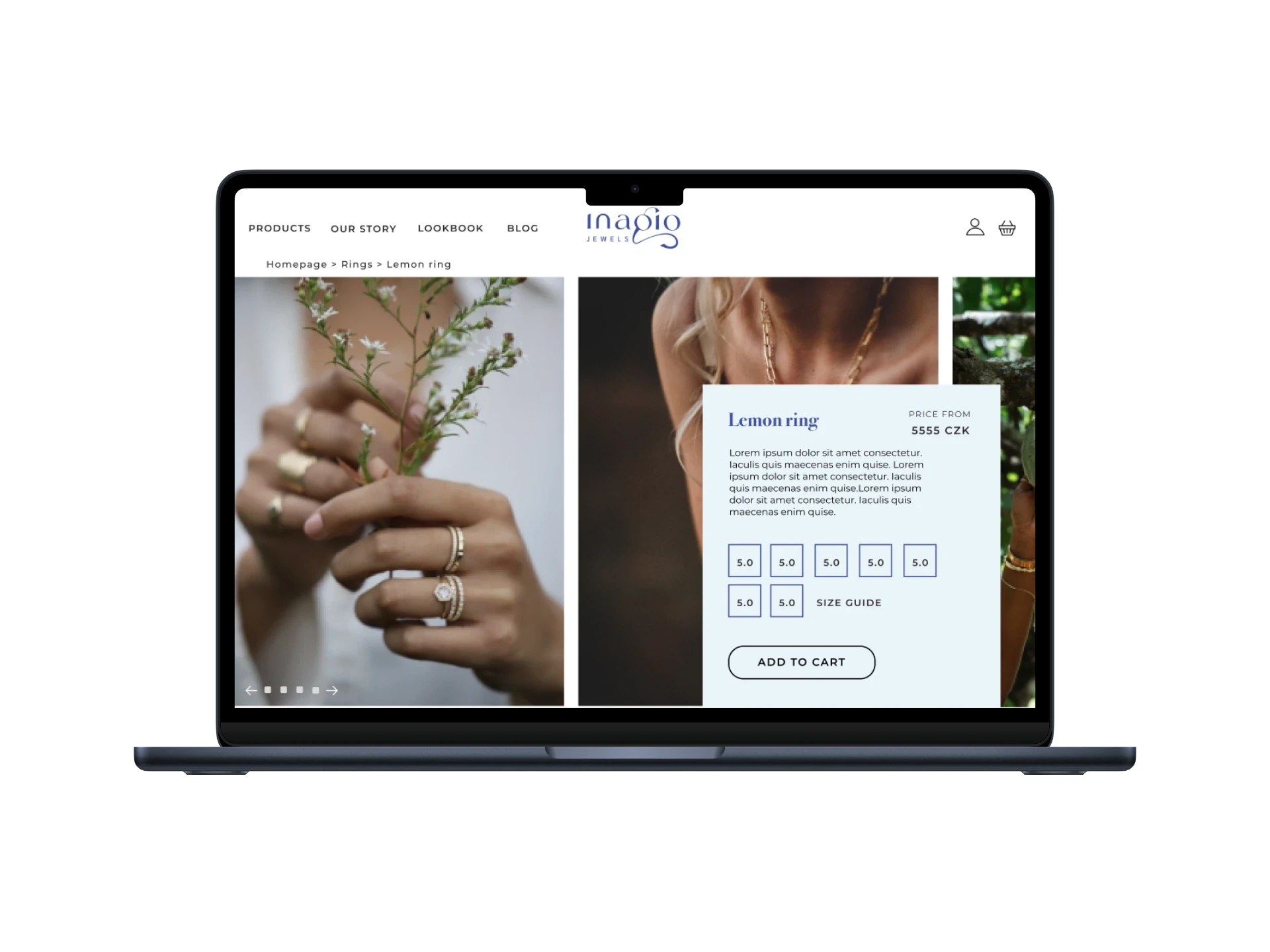
Packaging concepts covered jewelry boxes and paper bags — designed to create an unboxing experience that justified the brand's premium positioning. The website was designed for the e-shop and handed to the client's in-house developer to build.
Outcome
All design work was completed and delivered.
The company was paused before going to market — the brand identity, packaging, and web design exist as a fully resolved, ready-to-launch system.
Working on something similar?
The Launch Kit is built for exactly this.
Three weeks, flat fee, full brand foundation.